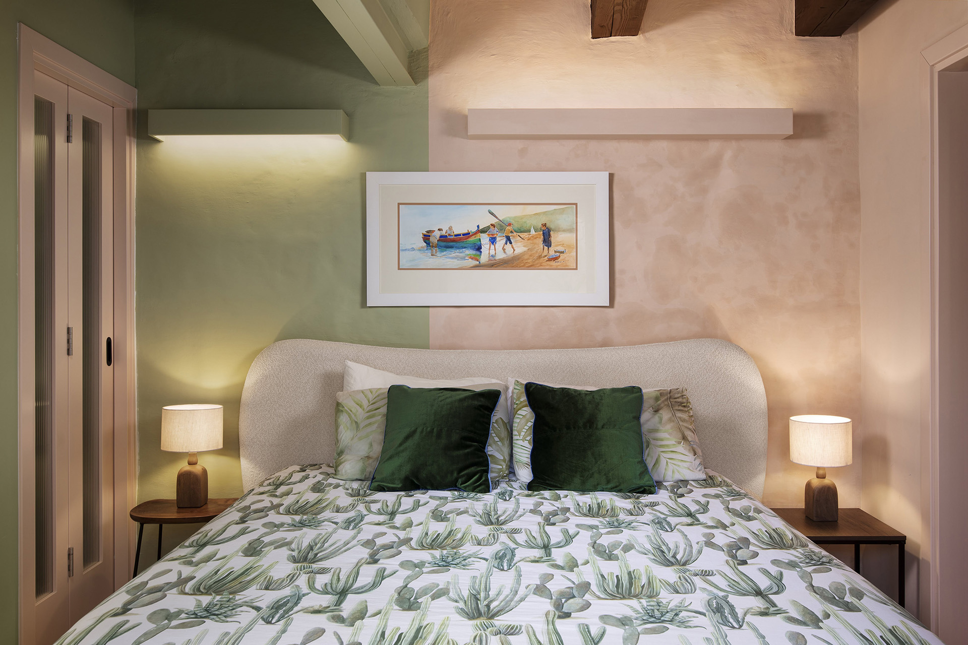
Whether through bold colour blocking or bursts of accent colours, the architects and interior designers who led the design of these residential spaces embraced the use of strong or vivid tones, to great effect. Take a look at these striking interiors from our archives that make a compelling case for the use of colour inside our homes.
Colour and geometry
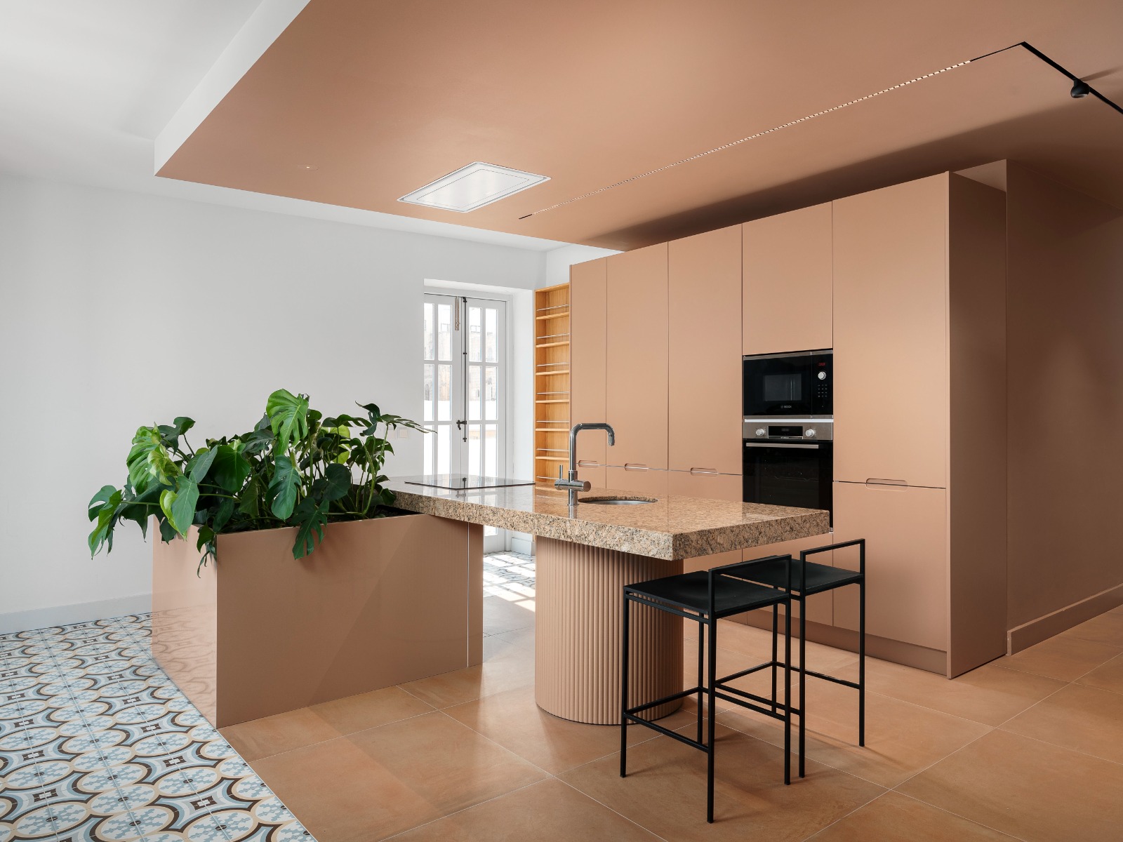
When working on the design of this holiday home in St Julian’s, Studio Niche’s Martina Fenech Adami opted for a design layout where the building’s envelope is internal-looking, and so began by designating a central space using colour blocking in an earthy orange tone, complemented by a powder blue shade used in the hallway and bedrooms. “The core of the home is established through colour, and that colour was a springboard that determined the rest of the spaces.” Read more here.
Contemporary character
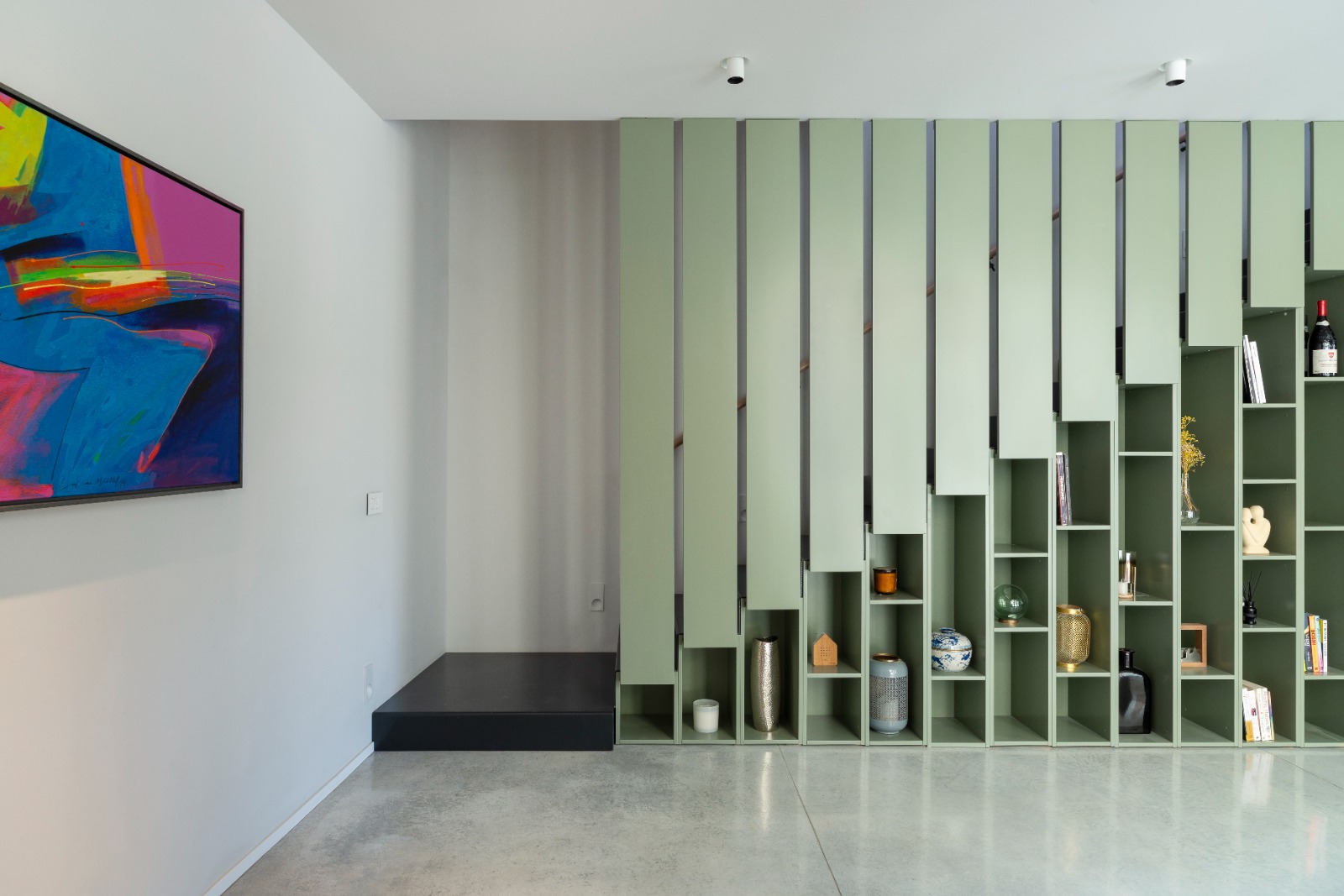
For this double-fronted 18th-century townhouse in Zebbug, Patricia and Steven Risiott, architects and founders of studio A Collective, began by salvaging as much of the original fabric of the house as possible while complementing the old with contemporary finishes, including teal apertures, coloured stone walls for the entrance that emphasise the striking barrel-vaulted ceiling, and a playful olive-green library that cleverly conceals a staircase. Read more here.
Nature-inspired interiors
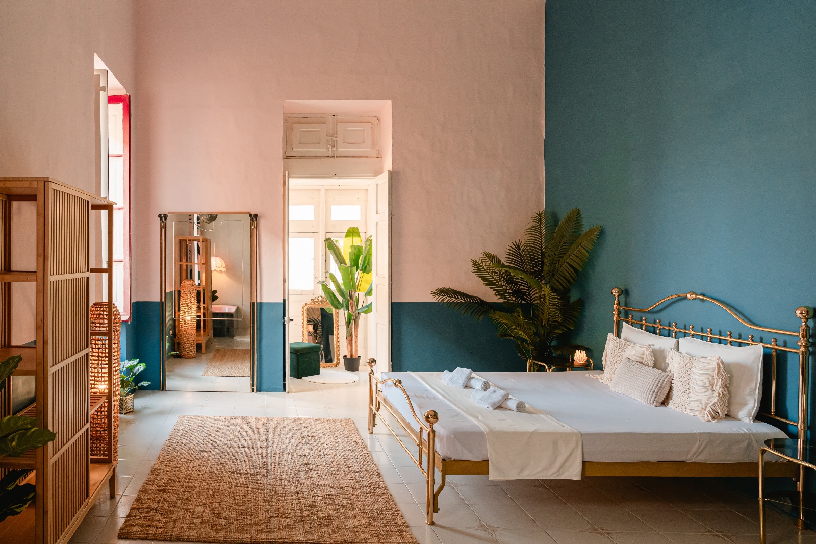
Interior design studio Artemis Interior, founded by Shalise Barnes, converted a 200-year-old property in the heart of Senglea into a five-room holiday rental with a quirky interior that revolves around a wilderness theme, thematically linking each suite to a wild animal with its own individual colour scheme that complements existing features of the original palazzo, including traditional patterned tiles and vintage pieces of furniture, such as a pink sink and bathtub from the 1950s. Read more here.
Bold and beautiful
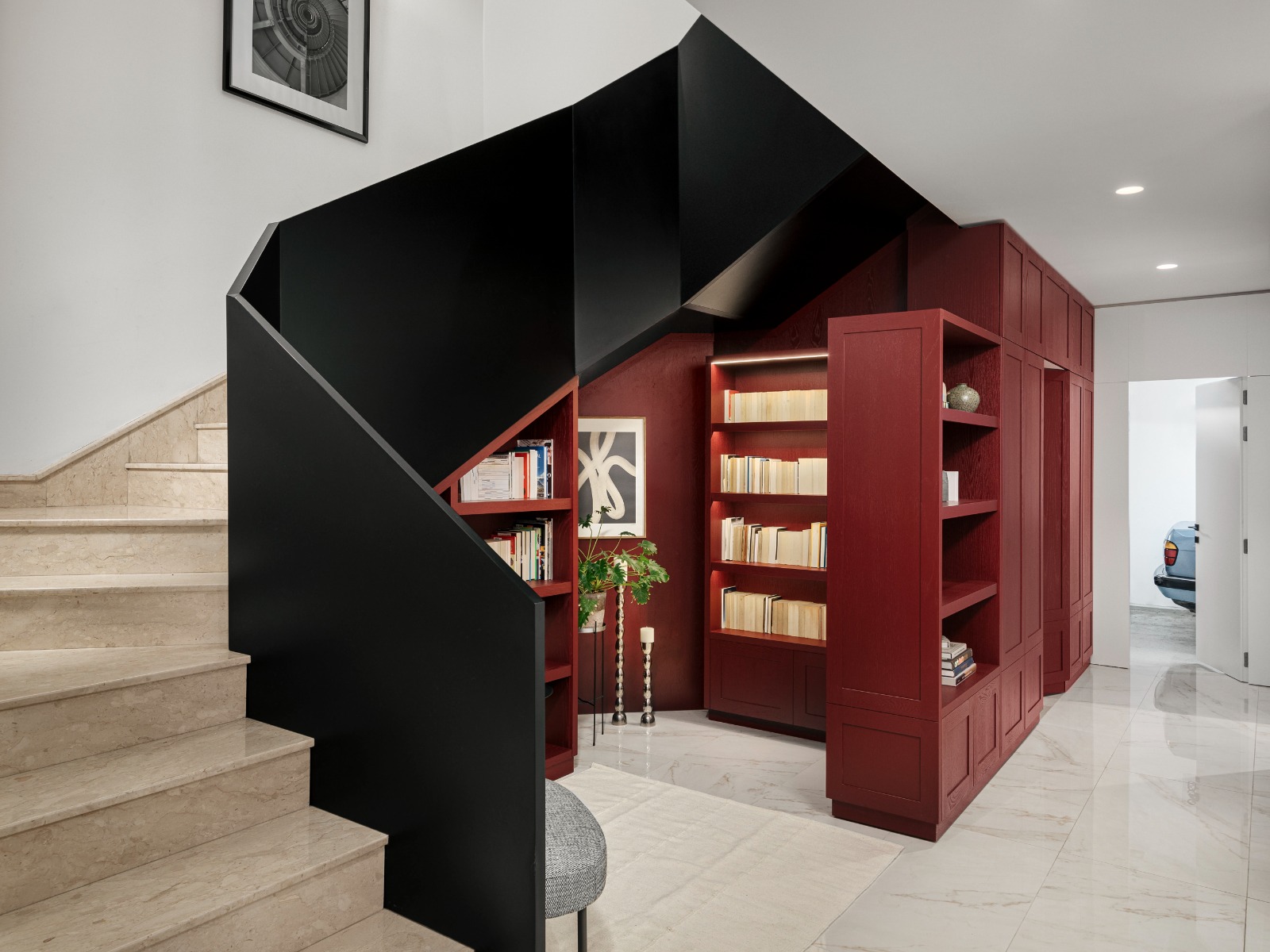
Angela Scibberas, founder of Angie the Architect, sought to imbue every space of her clients’ Rabat home with their individual personalities, and this is reflected no better than in the bespoke burgundy bookcase, composed of solid wood, neatly tucked under the main staircase. “This space is often overlooked, but we flexed our creative muscle to turn into an area our client would enjoy day after day, and that could flaunt her impressive book collection,” says Angie, singling it out as one of her favourite features in this house. Read more here.
A tale of pink and green
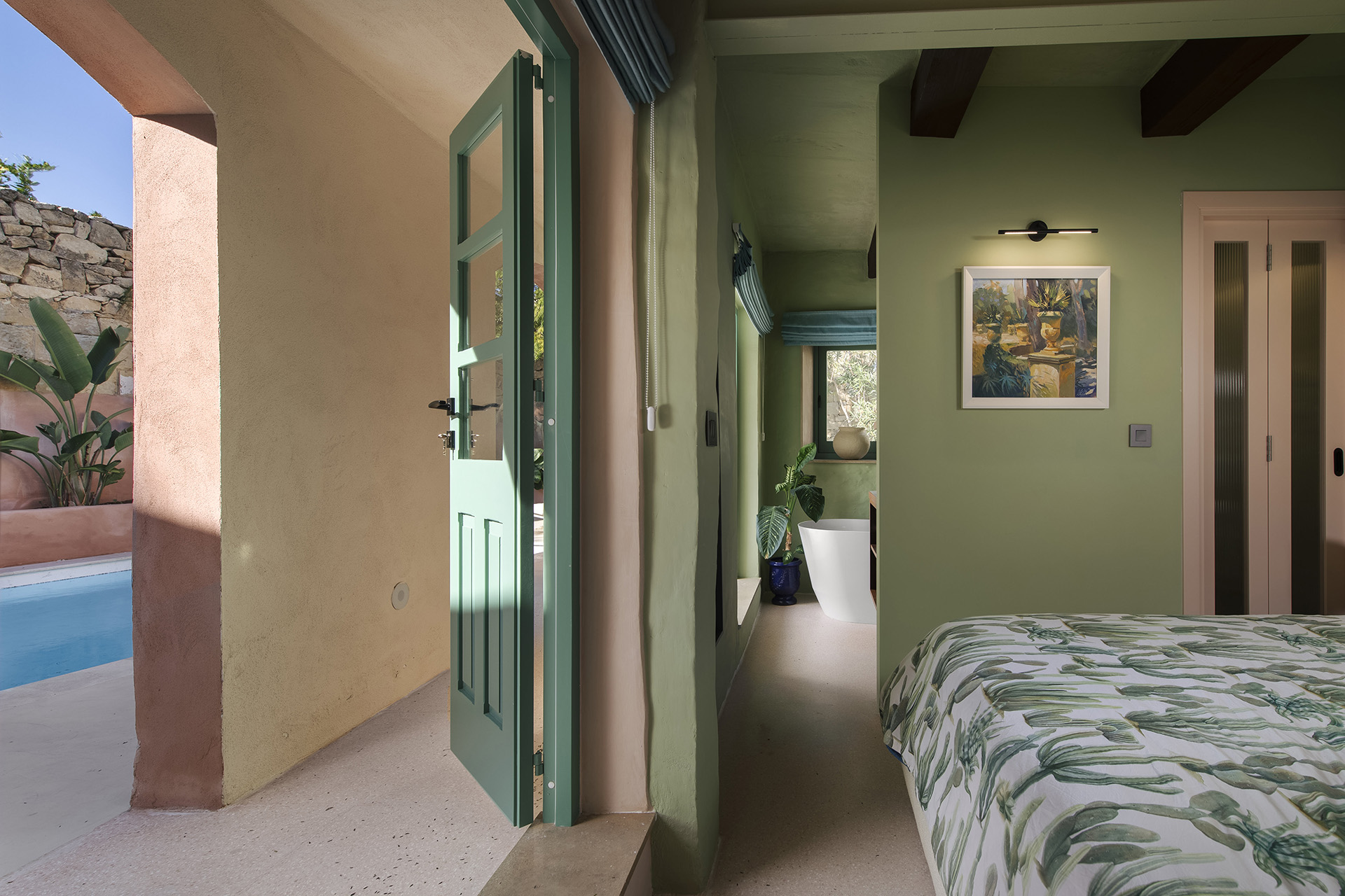
Presented with the task of designing a permanent home for her friend and client, Studio Niche’s Martina Fenech Adami drew on her knowledge of his likes and tastes to deliver an end result that is functional, maximises space effectively, and is a genuine reflection of his fun-loving personality. “There’s a fun play of muted pink tones circulating throughout the rooms that tie the house together, complemented by a punchy, saturated green. We adopted this palette throughout, using different textures and materials,” which complement the old limestone walls of this Zebbug townhouse. Read more here.
Classic meets modern
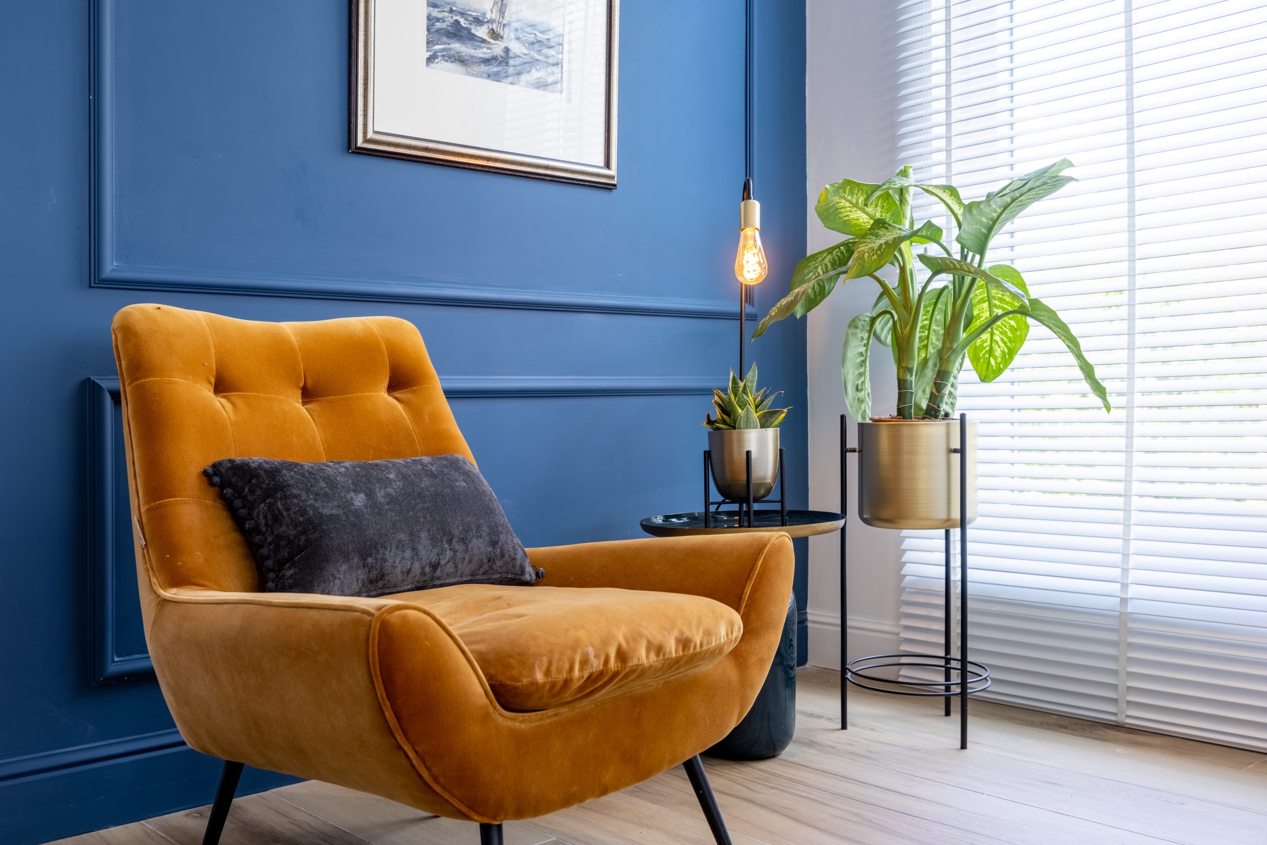
A modern-classic design concept defined the design of the open-plan spaces of this semi-detached villa in Kappara, led by Dominique Falzon, co-founder of Atmosphere Design. Balancing the neutral colour palette are bursts of colour that create focal points inside the home. “Using a bold, dark blue colour for selected feature walls was a perfect solution for achieving [this] feel. Certain furniture items, such as a burnt orange armchair which contrasts beautifully against the blue backdrop, enhanced this objective.” Read more here.
Main image: Ramon Portelli
If you enjoyed this article, you might also be interested in: Modern art pioneer Frank Portelli’s Attard studio to stage a performance that celebrates his legacy