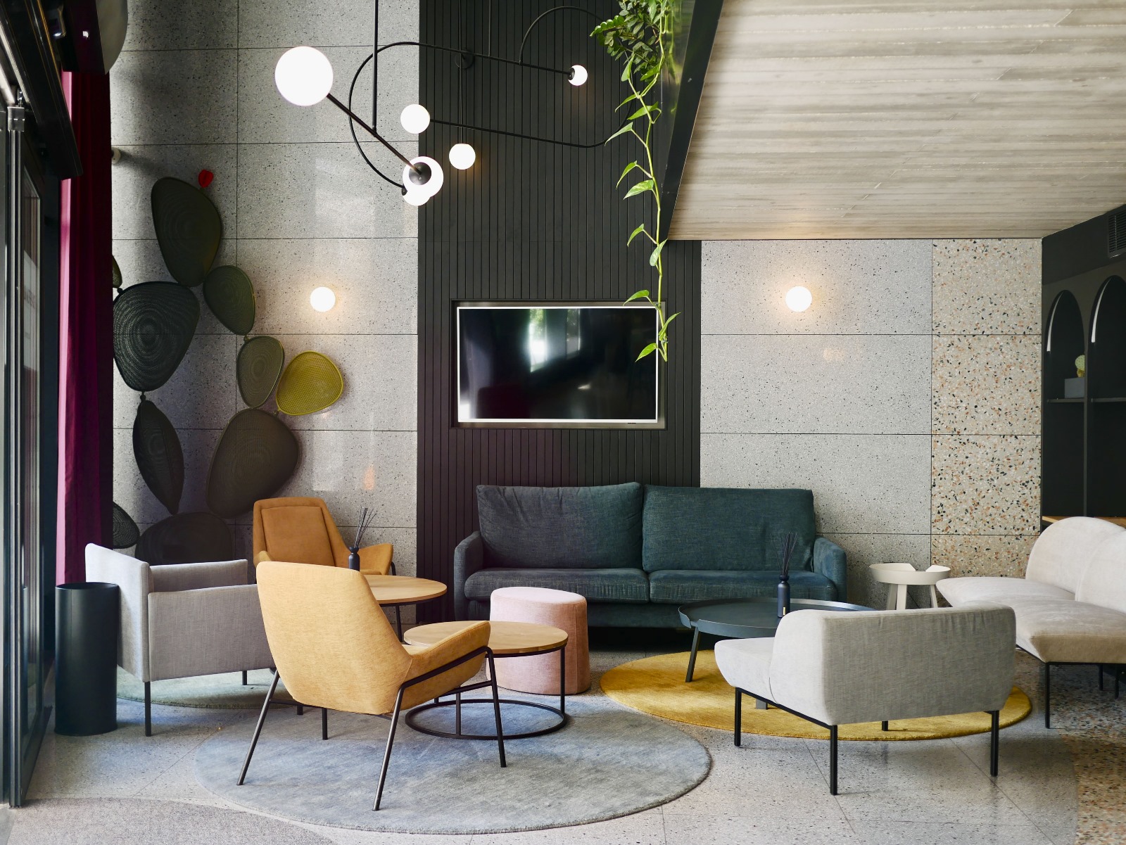
The prickly pear, an icon with strong connections to our islands, takes on a crucial character in the design of ibis Styles St Paul’s Bay – a member of the ibis Styles hospitality franchise with hundreds of hotels worldwide – for which architecture studio, Archi+, were the design consultants.
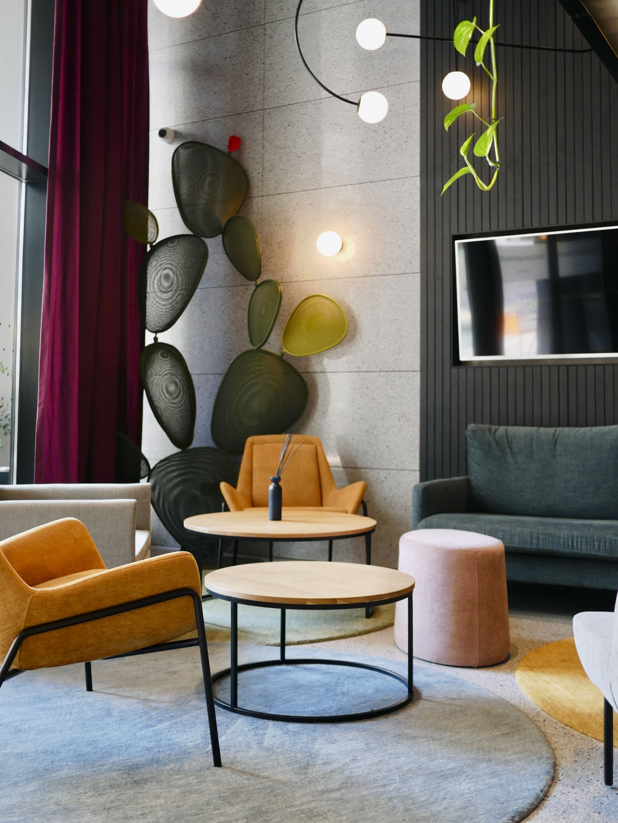
The brief was to create a space that is both aesthetically and functionally elegant, while bringing together a local developer, Elbros, and an international hotel franchise (ibis Styles) in their first hospitality joint venture. “For us, it was an exercise of finding every party’s strength,” the Archi+ team explains.
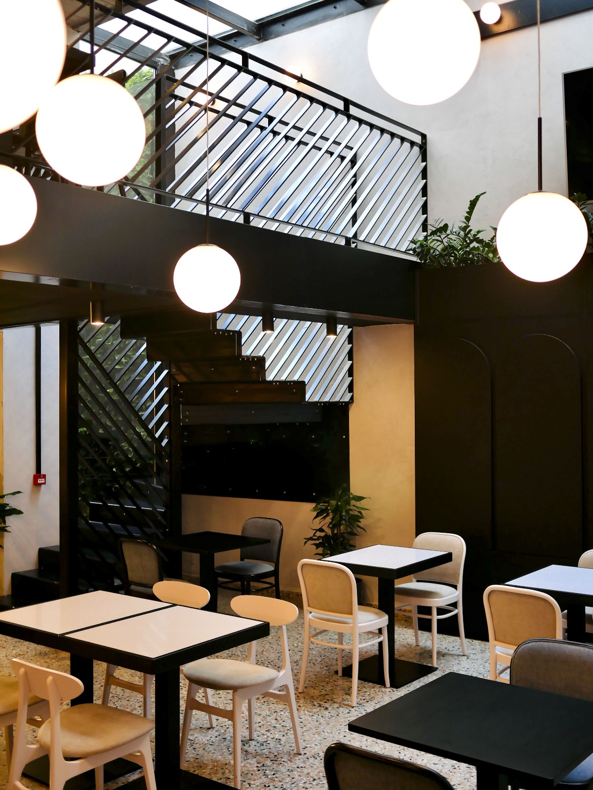
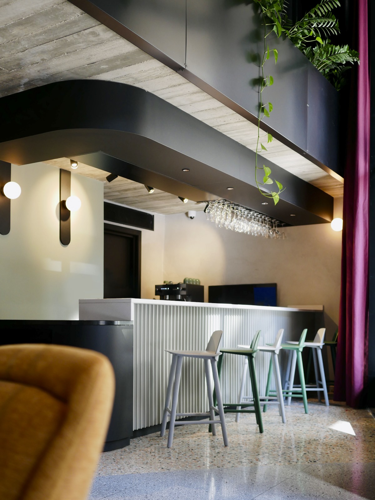
With the architectural shell already in place, Archi+ were put to task to combine interior design techniques with the guidelines and standards of the franchise, with the end goal being a hotel that is not only perfectly functional, but also elevated with a confident design.
“Both client and operator specified that the interiors should have strong local themes, such that the hotel is able to achieve a unique brand within the franchise’s international portfolio. Malta’s rugged natural landscapes and textured indigenous flora were tapped into as a source for colour schemes, materials, and other design cues,” says Archi+.
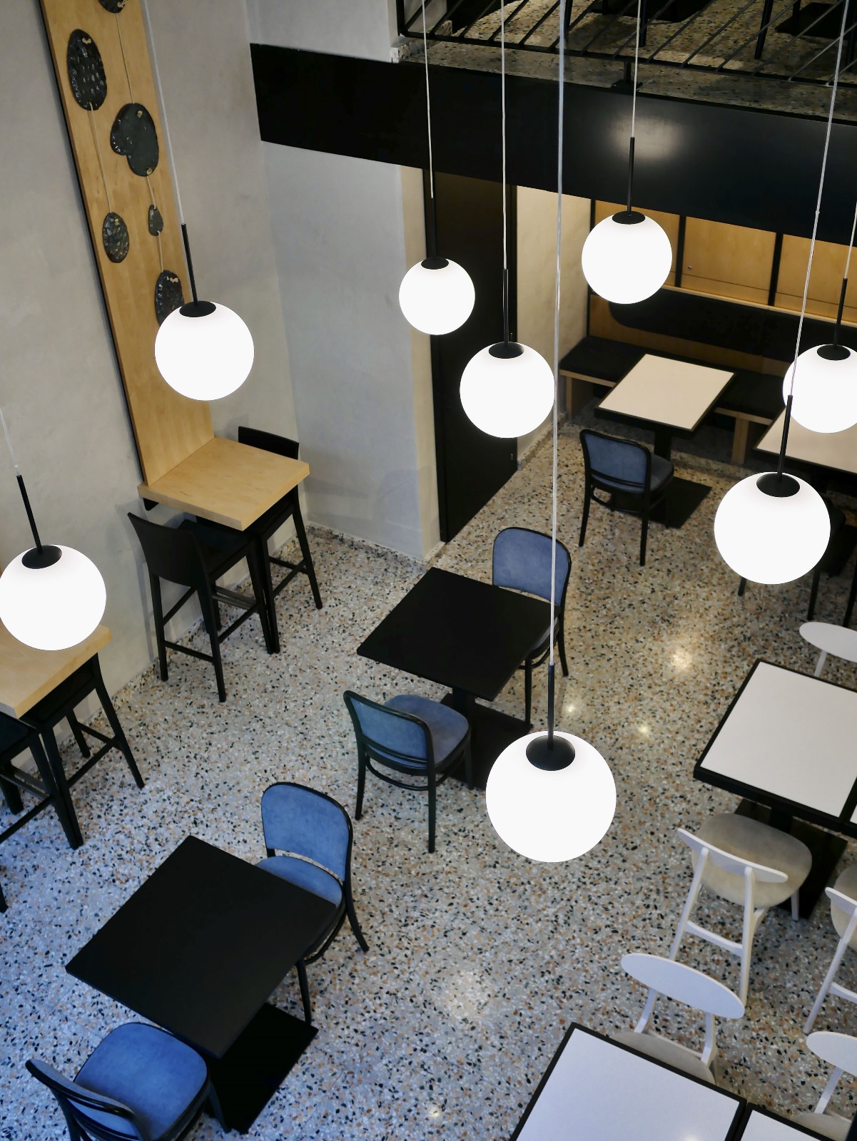
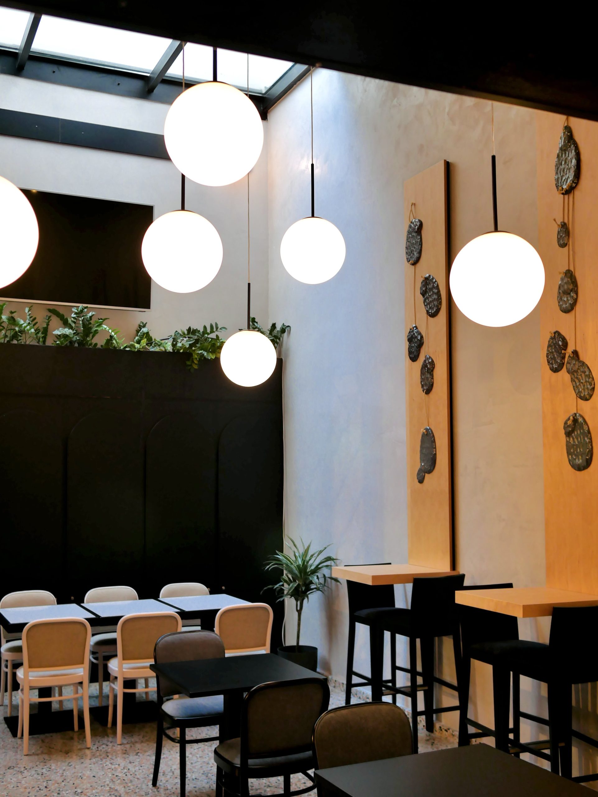
The team of architect designers, led by Head of Design Anthea Huber together with Shirley Agius Xuereb and Danica Jovanovic, turned to the rawness of nature-inspired tactile surfaces for inspiration, which were tempered by soft arched geometries in the furniture, upholstered elements, and a bold selection of colours.
“This expansive design narrative needed to be focused into a singular theme, one which was instantly recognisable. The prickly pear became the perfect icon to bring the whole design together.”
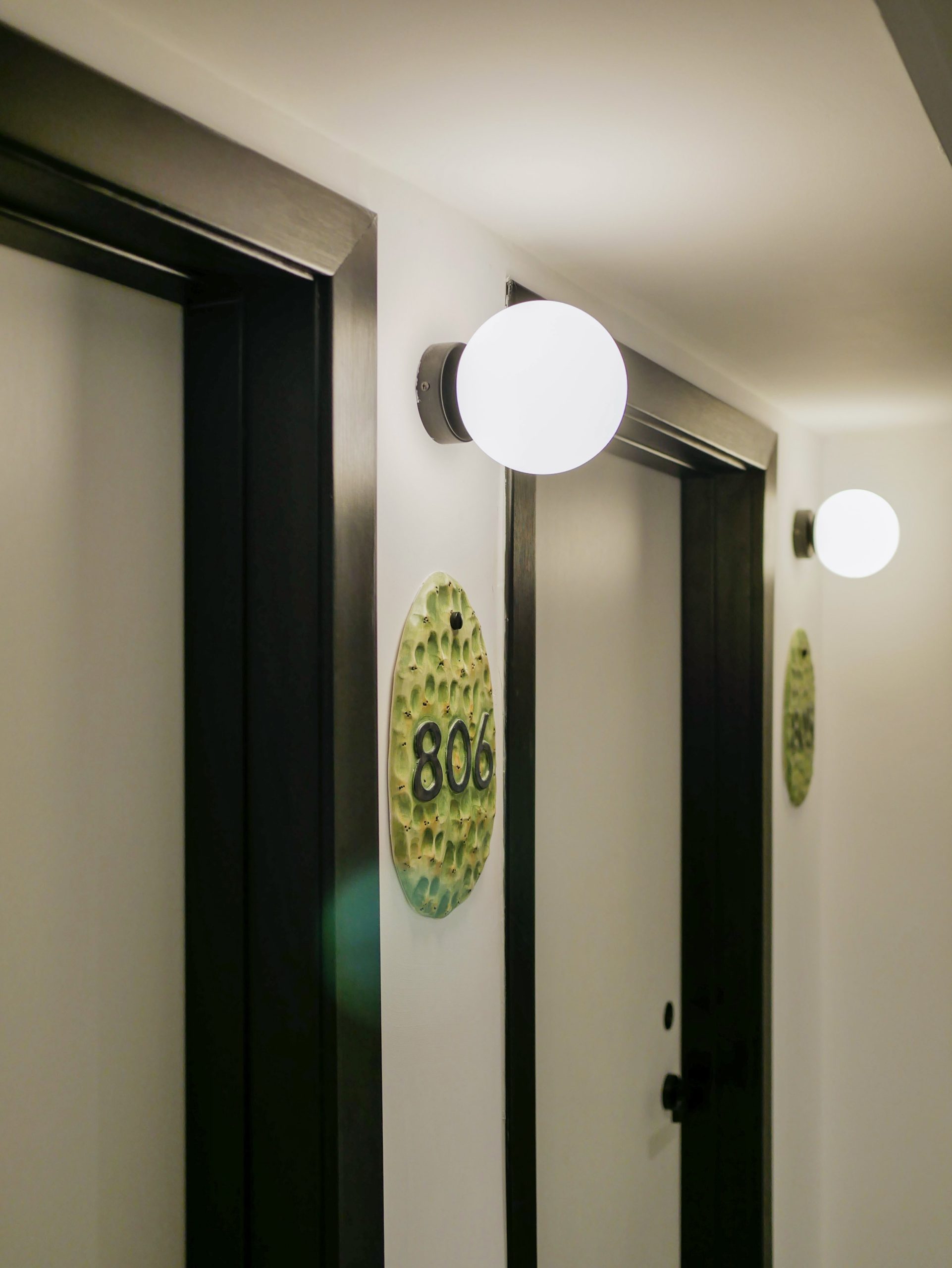
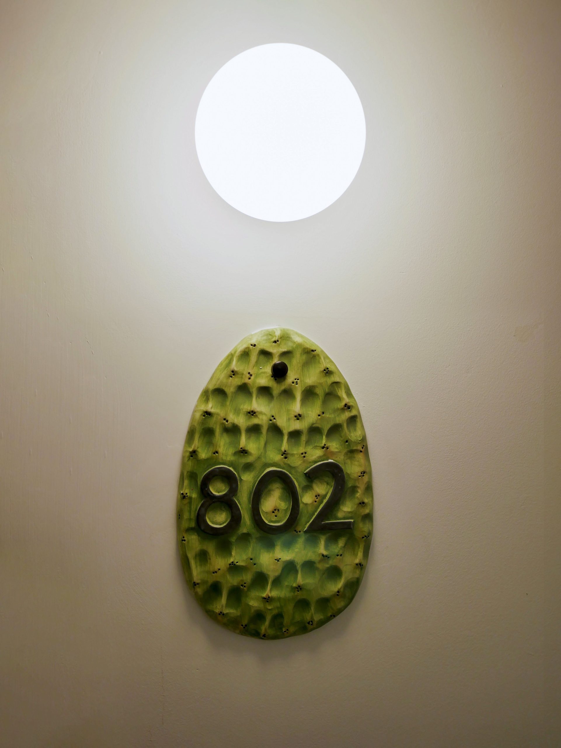
“Prickly pear motifs are found throughout the project,” they add, “in the form of carpeting patterns, 3D sculptures, and room number signage. In this way, the sensibilities and requirements of the tourism industry were acknowledged without diluting the design language of the hotel interior.”
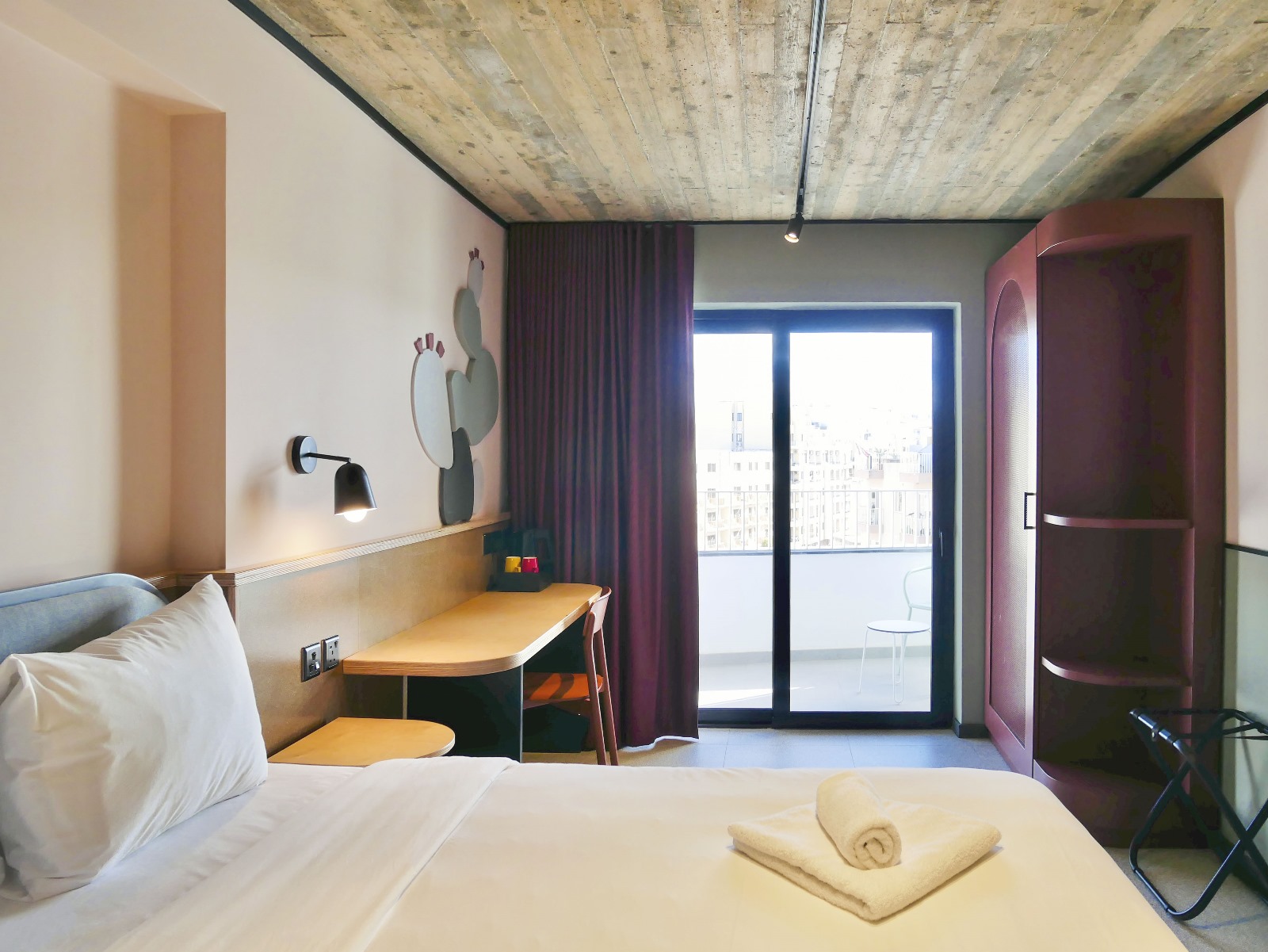
A design priority was to create an interior experience that stirs interest not only in terms of colour, but also texture. The design team drew inspiration from sedimentary rock and garigue landscapes, channelling it into finishes such as terrazzo tiling for various surfaces, including flooring, countertops, and walls.
This interpretation of texture is most evident in the raw concrete ceilings used throughout the hotel, which give spaces a naturally rugged feel, whilst simultaneously being an eco-conscious and cost-effective finish.
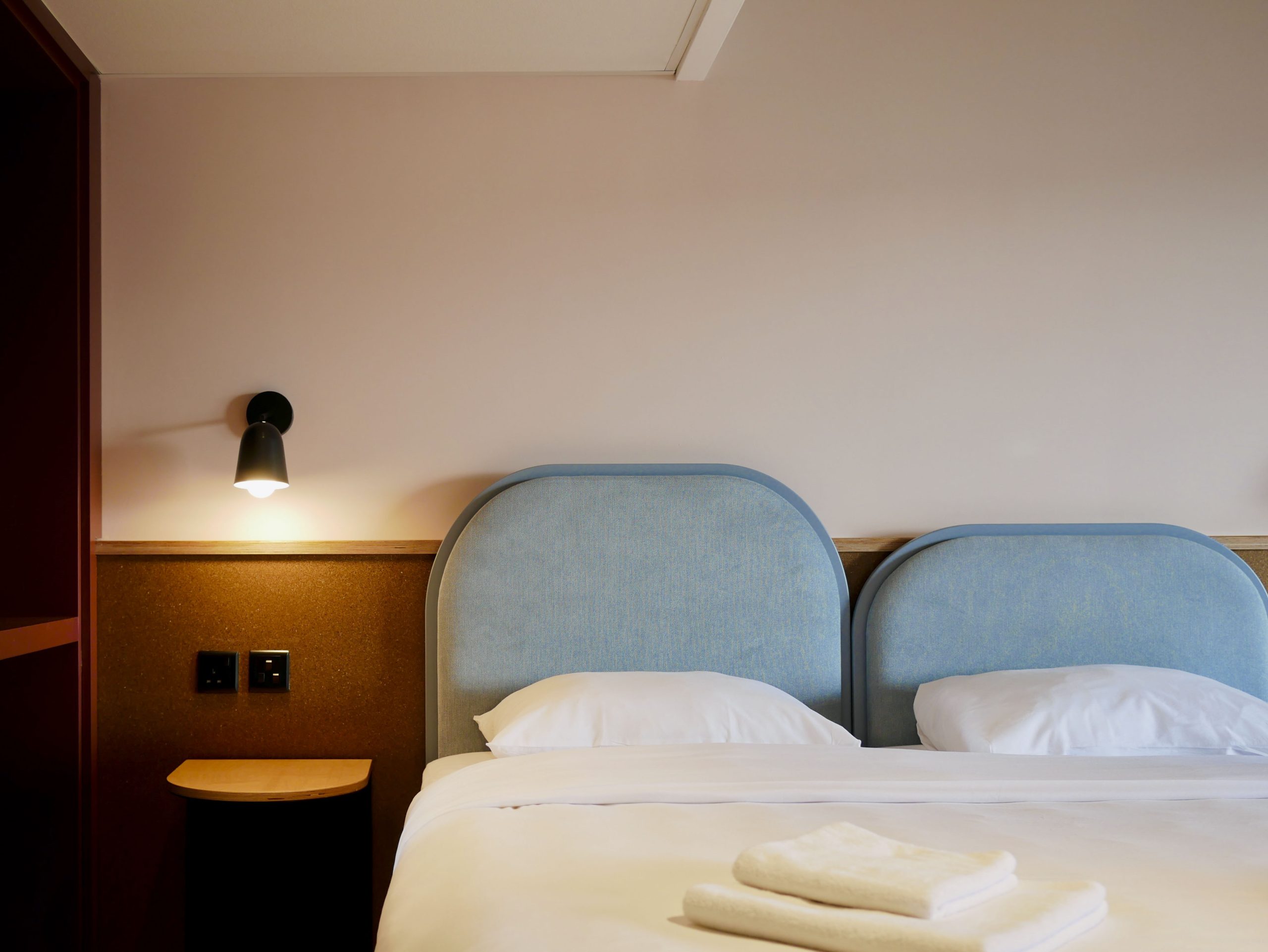
“Furthermore, perforated steel sheets were adopted as a reference to the instantly identifiable pits of alveolar erosion that happens wherever Maltese limestone meets salt water. These sheets were used to add depth and lightness to custom furniture pieces, making compact spaces feel airier.”
Part of the studio’s brief required the team to take on board a range of energy-efficient considerations that integrate seamlessly into the interiors. “Since the client was a local developer and allowed the team to directly communicate with the consultant engineers, it was imperative for us to stay in the loop and effectively coordinate all services,” they explain.
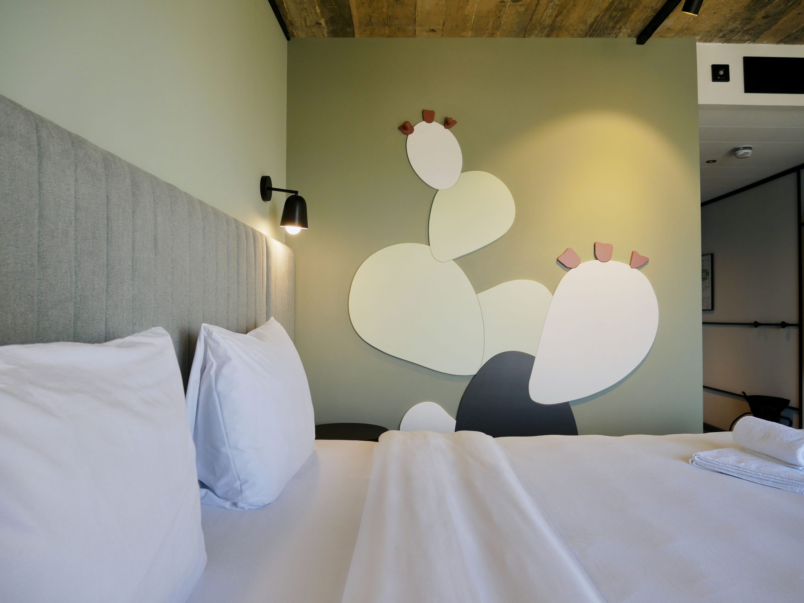
“Energy efficient LED lighting and heat-recovery cooling systems were equipped in all areas of the hotel. Thrakon blockwork was used throughout the building, integrating built-in insulation in most walls in the project. A supplementary water system was installed to re-use second class water for WC flushing and for irrigation of the multiple planters integrated in the project’s interior and exterior design.”
“Wherever possible, local manufacturing was used to reduce on unnecessary shipping. A large proportion of the furniture was custom made locally, and the custom-made prickly pear room numbers are also of local artisanal origin.”
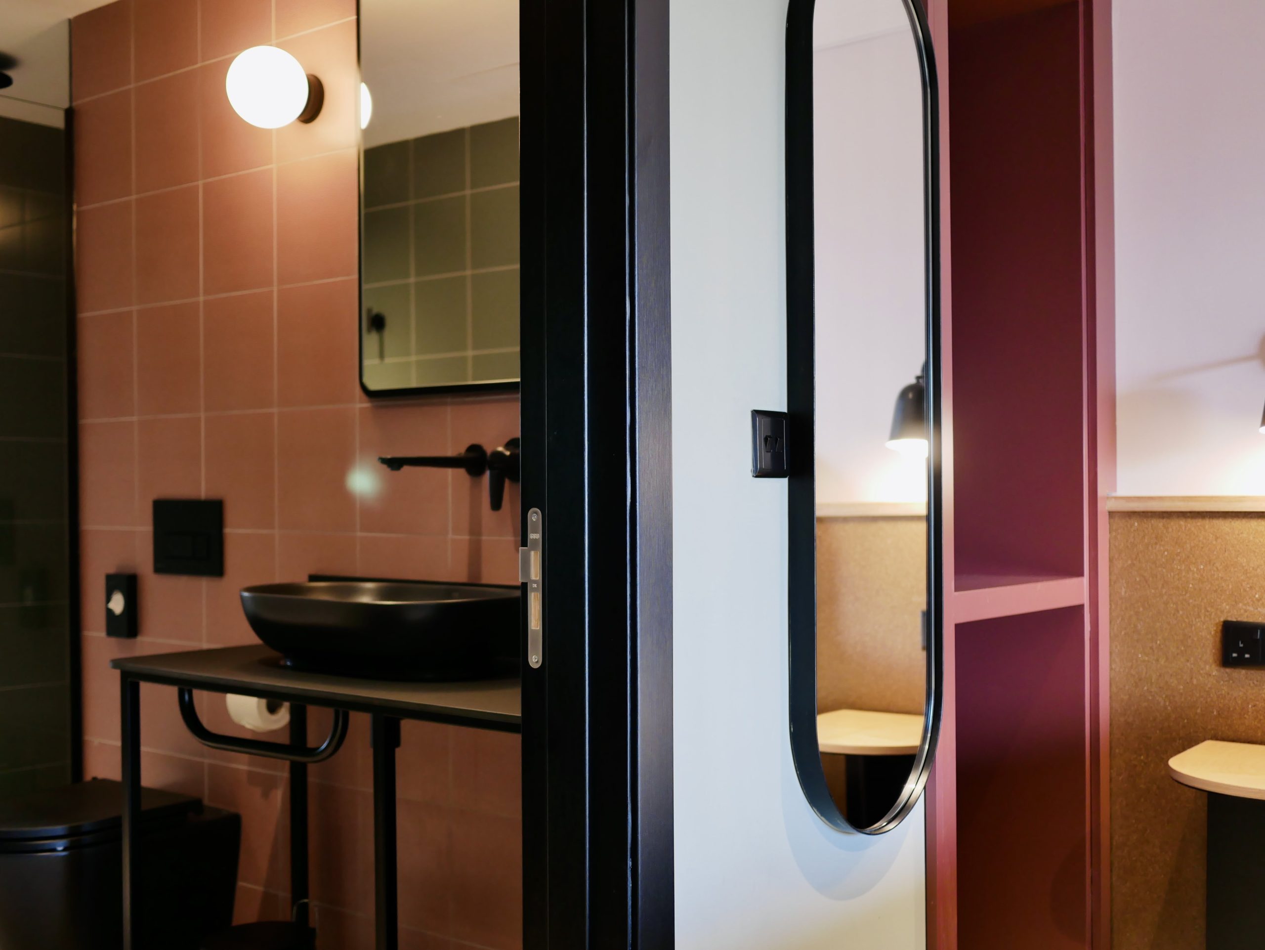
Singling out the most innovative part of the design process for ibis Styles, the Archi+ team highlights communicating with the tourism sector in order to strike a balance between what is expected in this industry and the standards of good interior design.
“In elevated 3-star developments like this one, these two perspectives are often at odds and most times this leads to compromised design. A single iconic element that people can associate with a particular hotel is important for good business, but is often reductive when hastily applied to an interior design scheme,” they explain.
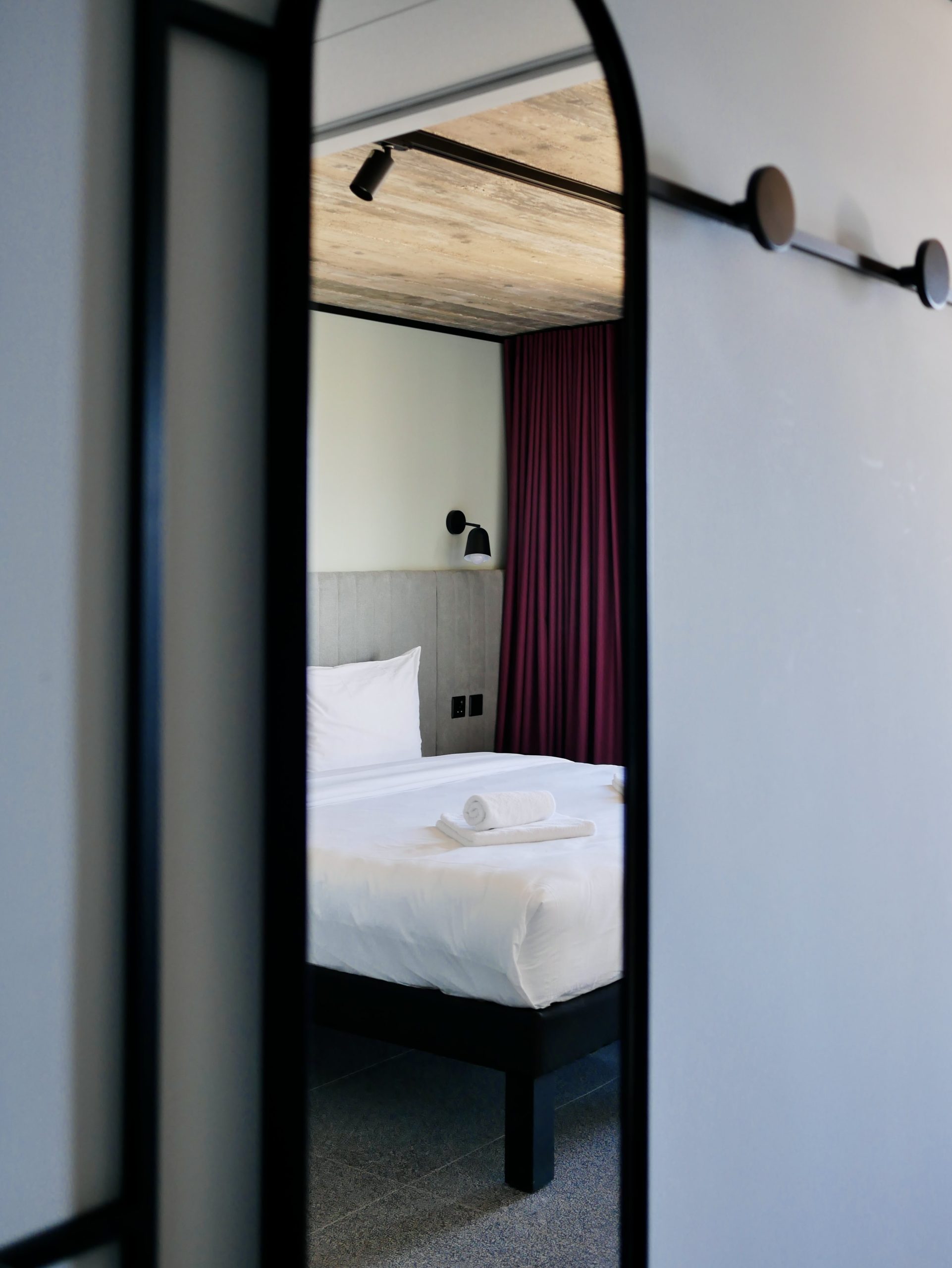
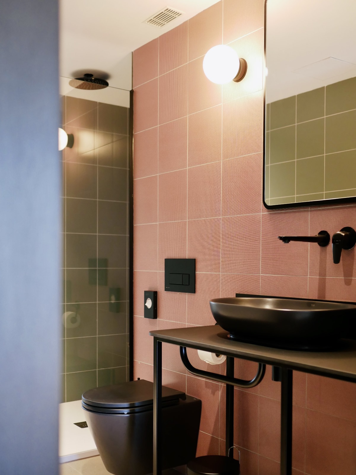
“Our solution for this problem was to find an element that is not divorced from the rest of the interior design. The prickly pear was perceived to be successful in moving away from the more overdone traditional Maltese symbols and an alternative that is not only immediately recognisable, but integrates elegantly with the rest of the design narrative.”
Photography: Matthew Grech