Earth tones, which are by definition colours found in nature, became somewhat of a buzzword in interiors over the past few years. Driven by a desire to bring the outdoors in (and to fight lockdown blues), earth tones surged in popularity, seen everywhere from floors and ceilings to furniture pieces large and small.
DesignDispatch singles out six moody-yet-soothing shades that continue to top mood boards one season after another.
Mauve
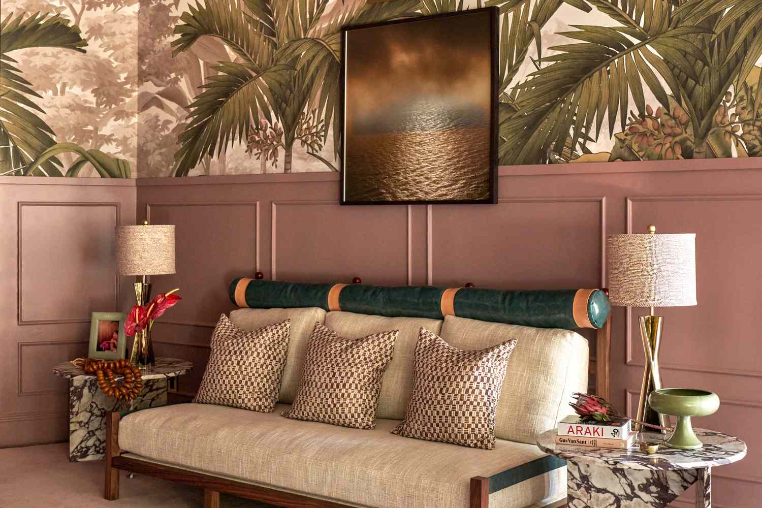
Described as a pale purple, mauve is a dynamic colour that pairs beautifully with many other colours, from green to cream, and many others in between.
Taupe
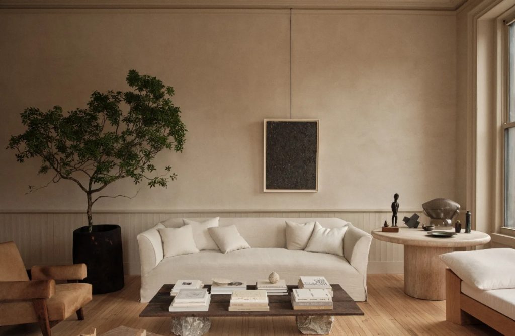
Hints of grey and brown come through in the subtlest way to create a colour reminiscent of clay and dried earth. This muted colour, which is often perceived as dull, adds warmth to a space in an understated way.
Pink
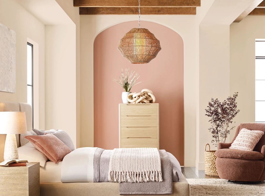
With so many shades of pink popping up in interior projects, it’s hard to pick a top favourite. From coral to blush to peach to rose, pink has a natural ability to soften a space, even if used in small doses.

Caramel
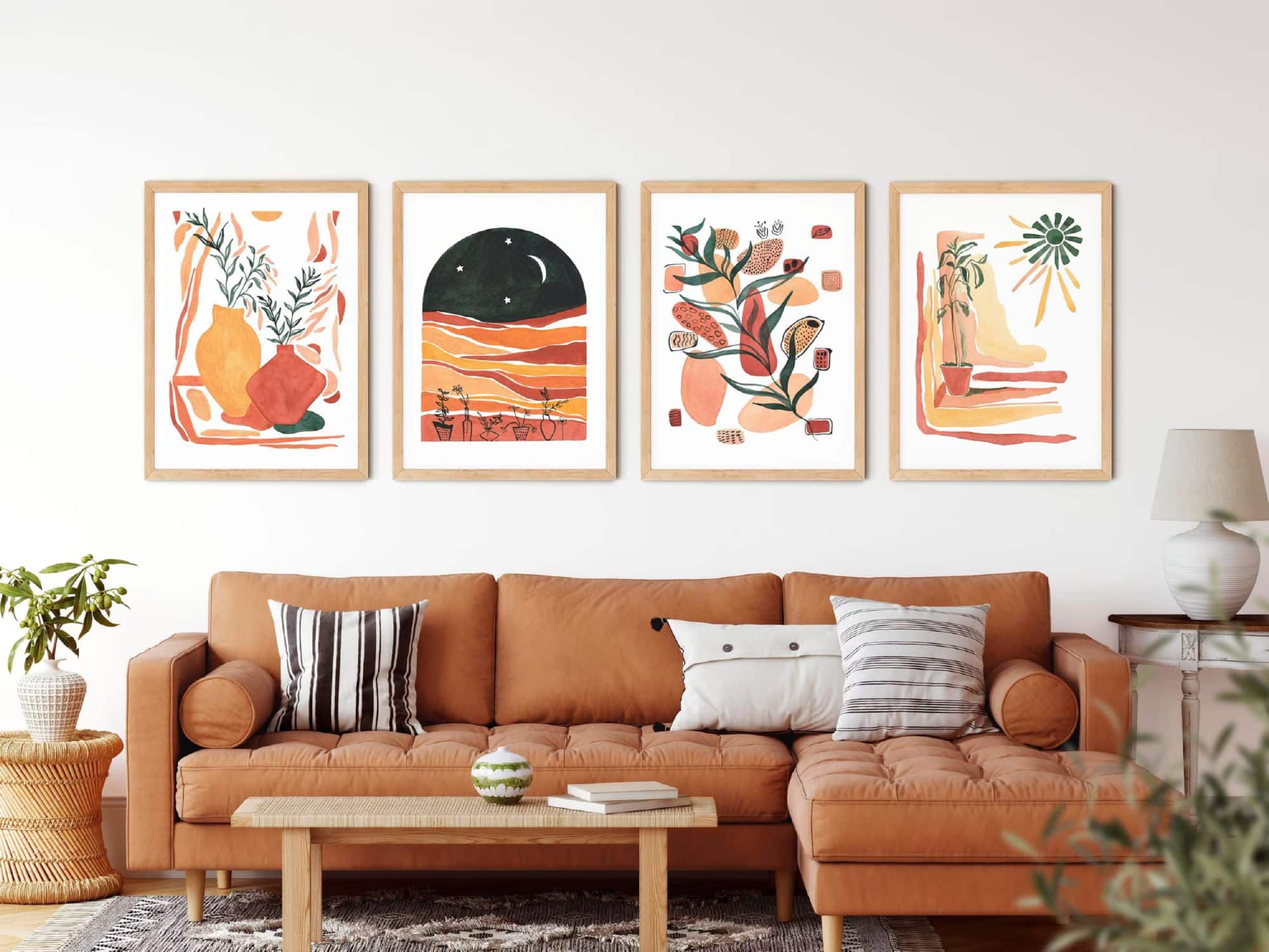
Sunsets and the cosy autumn season come to mind with this versatile colour, which combines shades of yellow and brown. If not for the walls, caramel is a widely used choice of colour for furniture and soft furnishings.
Blue-green
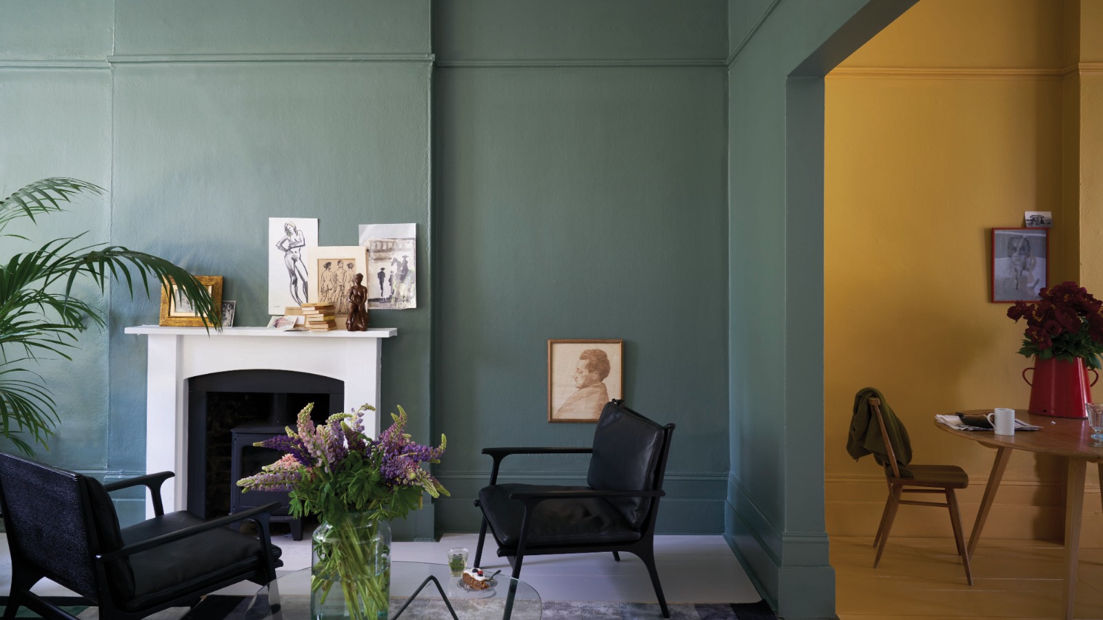
While sage and eucalyptus are still much-loved shades of green, a more current tone of this earthy colour features hints of blue, which adds depth and curiosity with its ability to alter according to the light.
Terracotta
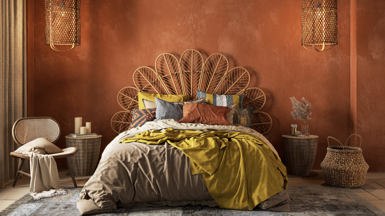
One of the go-to colours of the past few years, which continues to be highly sought-after, is terracotta, seen by many designers as the quintessential earth colour. Its ability to blend with practically every other hue makes a case for its popularity.